
Re-engraving 1909
Seventy-eight cards, each one engraved again, line by line, against the original
I thought I was making a deck look more refined. Only later did I see that most of the time, I was learning how to actually see the originals.
Lunarcana’s Card Library used to offer two sets of card art: the Lunarcana deck, and Classic, which uses scans of the original art from the 1909 deck. Now there’s a third, called Engraved.
It shows the same seventy-eight cards, with every figure and every object exactly where it always was. Only the way they’re drawn has changed. The lines are now fine engraved hatching, and the color is laid on in thin, transparent layers of hand-tinting, like a print made a hundred years ago and carefully kept until today.
This essay is about why I wanted to engrave those seventy-eight cards all over again, and about one thing I learned while checking them, card by card, against the originals.
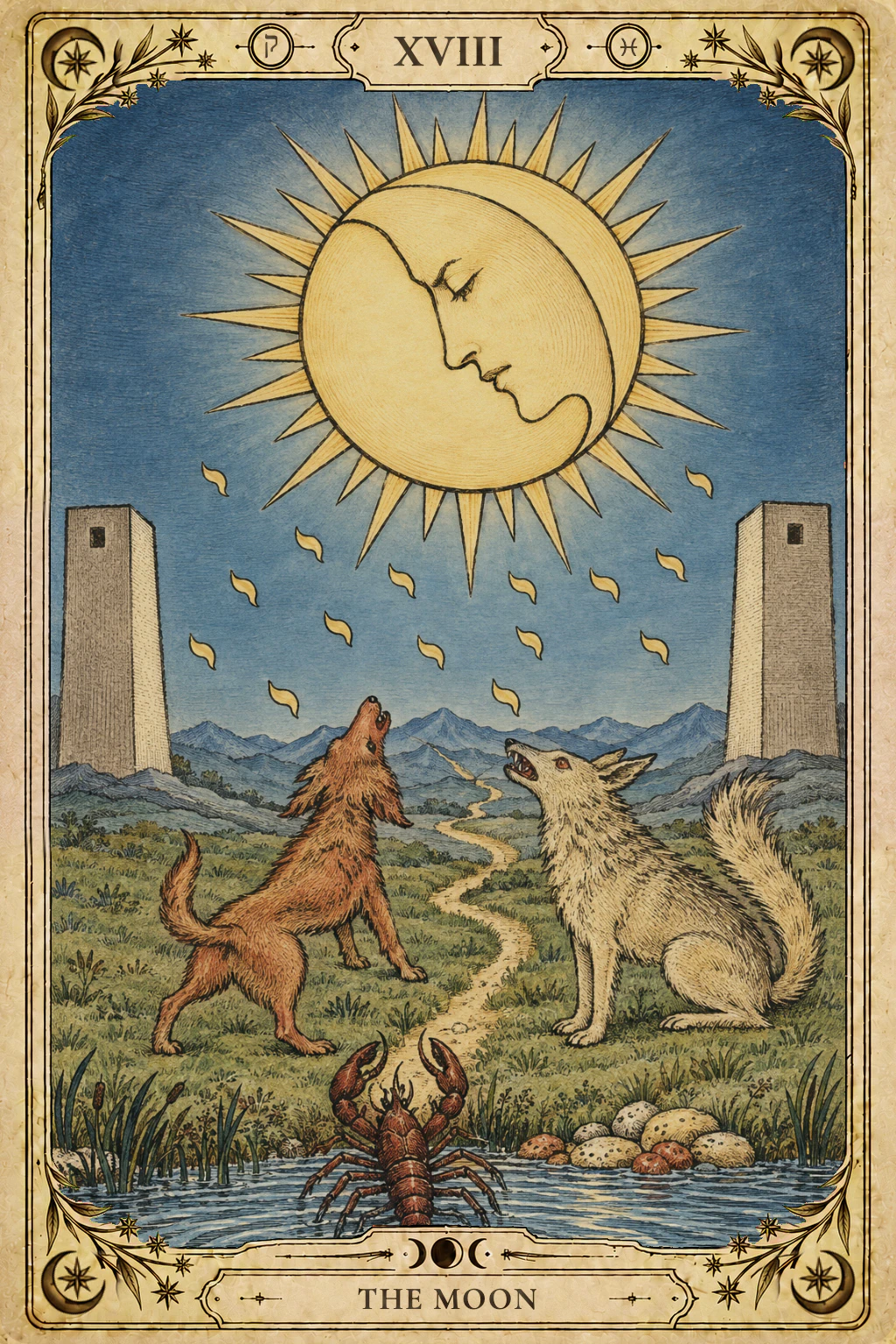
Nine images from the Moon card are hidden across the ten sections of this essay. When you come across one, glance back at the card above.
I wanted to see it a little more clearly
Motif I: The face in the moon — A face in profile is hidden in the moon, eyes closed, perfectly calm.In the year I’ve spent building Lunarcana, the thing I’ve looked at most is the original art of the 1909 deck. The composition of every card, the pose of every figure, the small, easily missed things in the corners — I’ve gone over all of them many times. The more I came to love them, the more one thing bothered me: the originals we actually have aren’t easy to see clearly.
Most of the originals you can find today are scans of prints made a century ago. The lines are thick, the color sits in flat patches, and when you zoom in you can still see the fuzzy edges and specks the printing left behind. A lot of the detail shrinks into a smudge on a phone screen, and you simply can’t tell what it’s meant to be.
Take the Moon. There’s a face in profile hidden inside the moon, with its eyes closed. On the old scans, that face is nothing but a few heavy black lines; by the time I first noticed it, I had already looked at the card many, many times.
So I wanted to do one thing: change nothing about the originals, only draw them more finely, so that what was always on the card could be seen more clearly.
The woman who drew this deck
Motif II: The twin towers — Two towers stand on either side of the plain, one left, one right, equally tall, equally silent.When people talk about this deck, many think of Waite’s name first. But the seventy-eight cards were drawn by a woman, a painter named Pamela Colman Smith1.
The deck was published by Rider in London in 1909. The usual view is that Waite set its structure and meanings and gave the direction for most of the Major Arcana images, while the scenes on the fifty-six cards of the Minor Arcana were mostly Smith’s own invention. Before her, the number cards in most tarot decks simply arranged a few cups or a few wands across the card. She gave almost every one of them a scene, with people in it, and a story. If the Three of Swords makes us think of heartbreak today, and the Ten of Cups of a family standing under a rainbow, that is largely thanks to her.
Yet for a long time the deck traveled under the names of its publisher and of Waite. Hers appeared only as a small monogram, tucked into a corner of most of the cards.
That’s why, at Lunarcana, I prefer to call them “Smith’s 1909 originals.” And this re-engraving was, in part, a way of looking carefully, once again, at what she drew.
A new way of drawing, nothing new in the picture
Motif III: The rays — Thirty-two rays surround the moon, sixteen long and sixteen short, set long, short, long, short.Before I started, I gave myself a few rules.
The first: whatever is in the original gets drawn, and nothing else. Figures, animals, the number of objects, where they are, which way they face and how they stand — all of it stays. Nothing the original lacks gets added, and nothing it has gets taken away. If there are thirty-two rays around the moon, sixteen long and sixteen short, then every one of them is counted.
The second: the picture and the border are made separately. The card’s name, its number and the little symbols in the corners are set by the border; not a single letter appears inside the picture. The border was designed on its own and went through nearly twenty rounds of revisions. In the end all seventy-eight cards share one border design, with only slight differences between the Major Arcana, the four suits and the court cards.
The third: the color has to be restrained. I tried a few more saturated versions, and every time my own first reaction was “too much.” What stayed was color that has faded a little, as if under an old coat of varnish, on warm ivory paper with only the finest fibers in it — no stains, no yellowing.
The first card I tested was the Eight of Wands. One version came out especially beautiful, with fine lines and gentle color, and I stared at it for a long time. But it had put a few clouds into what was originally a clear sky, and turned a tiny house in the distance into a large one with a tower.
That version didn’t make it.
Beauty isn’t worth trading away anything that’s in the original. I learned that on the very first card, and it became the line I held for the seventy-seven that followed.
The reverse is true too, though: being faithful to the original doesn’t mean copying its coarse lines and the ragged edges of the print. In one version we leaned so hard on “exactly like the original” that the lines went thick again and the color went back to flat patches — barely different from the old scans. That version didn’t make it either.
You can’t lean too far either way: nothing missing from the content, nothing crude in the drawing. Every card after that was a matter of finding its place between those two.
Seventy-eight cards, checked one by one
Motif IV: The drops — Fifteen drops of light fall from beneath the moon, eight on the left and seven on the right, shaped like the Hebrew letter yod.If I had to say in one sentence how this deck came to be: Redrawn from Pamela Colman Smith’s 1909 originals with AI assistance, every card checked against the original.
In practice, every card went through the same steps. First, the picture area is cropped out of the original. Then everything in it is written up in a detailed description — where each thing sits, how big it is, which way it faces. Then the card is redrawn from the original, and once it’s drawn, it’s checked against the original item by item.
There’s a lot to count in that check. The drops of light falling beneath the moon number fifteen, eight on the left and seven on the right. How many pomegranates are on the veil behind the High Priestess? Does the Empress’s crown really carry twelve stars? Is every hand drawn right? If a count is off, the card is drawn again.
The checking isn’t done by whatever drew the card. A separate, independent review — with the original, the description we wrote and these rules in hand — goes through it point by point looking for faults. When it finds one, we go back, fix the description, and draw another version. After the check, I take a last look myself, and only when I nod is the card final. There were also a few cards where the review could still find some small discrepancy at the very end; I looked at them, and decided to let them stand as they were.
Of the seventy-eight, twenty-odd passed on the first try. The hardest took more than thirty versions.
About halfway through, I found out something that left me a little embarrassed.
When a card kept failing, the fault was often ours
Motif V: The crayfish — A crayfish climbs out of the water onto the bank, claws held out in front, its tail still in the water.When a card kept failing, at first I put it down to bad luck: try enough times and one would come through.
Then I enlarged the original and went through the description we’d given it, sentence by sentence, and found the problem was often the description itself. Of the eighteen cards stuck at the time, in about eight the trouble wasn’t the drawing at all but the description: we were asking for more than the original showed, or for something different altogether.
That was the whole gap.
Smith often didn’t draw each finger on a hand. She drew a round hand shaped like a mitten. But our description said “five clear fingers,” so the closer the drawing came to the original, the less chance it had of passing the check. There were others like it: the description called for six dots on a hem, or four tree trunks in a scene, when the original never drew them that clearly; and the infinity sign above the woman’s head on Strength had been written as a neat, level figure eight lying on its side.
The original was there all along. What needed fixing, more often than not, was how we described it.
Every time, the fix was the same: go back to the original, enlarge it, see clearly what it actually shows, and rewrite the description to match. Once the description was right, several cards that had been stuck for more than ten rounds went through quickly.
One word can bring a whole landscape with it
Motif VI: The far mountains — Where the plain ends, a line of pale blue mountains sits far off behind a thin haze.There’s another kind of mistake, and it’s harder to spot.
On one card, there was only a small house in the distance. The description called it a “cottage,” and the house that came back had a chimney on the roof. We tried other words, and the chimney stayed. It turned out that, as far as it was concerned, a cottage in the country simply has a chimney.
The little house on the Ten of Cups still has a chimney on its roof in the end. That one, I chose to accept.
The same thing happened again and again. Write “distant fields,” and hedgerows grow up between them, row after row. Write “a thin blue-grey haze over the distant hills,” and what were low hills turn into high mountains.
Worse, you can’t fix it by writing “don’t draw a chimney.” Once the word “chimney” is down on the page, a chimney actually becomes more likely to appear. All you can do is find a way of putting it that’s less likely to drag a chimney in with it — or describe only the shapes the original really draws.
Later it occurred to me that this doesn’t only happen in pictures. When we say a word, we often bring along a whole set of images we never realized came with it.
The things we got wrong
Motif VII: The dog — The dog on the left rears up, head thrown back, barking at the moon.In a few places, it was the original itself we had misread.
On Judgement, the angel is blowing a trumpet. But in the description, that trumpet had been read as a finger held up to the lips, as if the angel were asking everyone to be quiet. On Death, part of a robe had been read as a stream of water; and on another card, a king’s shoes had been read as a few shapes on the sand. The lines in the originals are coarse, and some spots really are easy to misread. But once a mistake is written into the description, it gets drawn with complete care — and the finer the drawing, the more confidently wrong it becomes.
Two of these I caught myself, staring at the screen: however I looked at it, something seemed off, and when I went back to the original, it turned out not to be that way at all. For Judgement, we went back in the end to the guide Waite wrote for this deck, and he is quite clear on the point: the angel is blowing a trumpet.
Around that time, I came to understand “seeing” a little differently. We think what we’re looking at is the original. Much of the time, what we’re looking at is our own understanding of it.
This card: the Moon
Motif VIII: The wolf — The wolf on the right sits with its head raised to the moon too, its bushy tail curled up behind it.This issue’s card is the Moon. It’s also the card the Card Library uses to show what switching card art looks like, because the three decks differ most visibly on this one.
The Moon passed on its second version. The first had two problems. One was right above the moon. In the original, the card’s number, XVIII, is printed over the rays there and hides part of them. In the redraw, the number has to come out and the gap has to be filled with rays; the first version filled it with a crowded tangle, and the long-short rhythm fell apart. For the second version, the description was changed to “the rays at the top run long, short, long, short, just like those at the sides and below,” and they lined up neatly. The other problem was a sky pressed too dark; the second version brightened it a little.
On this card I also took one small liberty. The original sky is a very pale blue, almost like daytime; Engraved paints it as dusk, with a very faint halo around the moon. Beyond that, the dog is still on the left, the wolf is still on the right, the crayfish is still climbing out of the water, and the little path still sets out from the water’s edge.
If you’d like to see the three decks side by side, go to the Card Library and switch between them with the Card art control at the top — the sample card is this very Moon. Once you’ve chosen Engraved, open the Moon, and you’ll see it as it looks re-engraved.
After the checking
Motif IX: The path — A path sets out from the water’s edge, runs between the dog and the wolf, and goes on into the far mountains.Now that all seventy-eight cards have been re-engraved, the biggest thing I’ve come away with isn’t one more beautiful set of card art. It’s that I learned all over again how to look at a picture.
Everything you’ve read is on this card
- The face in the moonChapter 1
- The twin towersChapter 2
- The raysChapter 3
- The dropsChapter 4
- The crayfishChapter 5
- The far mountainsChapter 6
- The dogChapter 7
- The wolfChapter 8
- The pathChapter 9
If I had to pair this essay with a card, I’d choose the Moon. Its number in the Major Arcana is eighteen.
Almost everything on this card has to do with not seeing clearly. The face in the moon has its eyes closed, and under the falling moonlight everything wears a soft blur. The dog and the wolf face each other across a little path, both heads raised, both crying at the moon — one tamed, one wild, like two readings of the same thing. A crayfish climbs up out of the water, like the thoughts that usually stay sunk at the bottom and surface the moment you stop paying attention. Two towers stand on either side, and the path runs between them, on into the far mountains, with no end in sight.
Several times during the re-engraving, I felt I was standing at the start of that path: thinking I had seen the original clearly, when what I saw was my own description; thinking it was bad luck, when I had been adding my own imagination to the picture.
I used to think this card was about confusion. Now I’d rather read it like this: when you can’t quite see, don’t rush to a conclusion — go back to the original, and look again.
A last word
Engraved isn’t meant to replace the originals. The Classic card art is still there, and not one of the original scans has been touched; anyone who loves the plain, rough lines of the originals can switch back at any time. I only hope to offer one more way of looking at them.
While I worked on this, I often thought of Smith. More than a hundred years ago, she drew these seventy-eight cards; more than a hundred years later, they are still being turned over and studied, again and again. This time, all I did was look carefully, once more, at what she drew.
To see something clearly, you first have to admit you might be seeing it wrong.
The originals have been there all along; what changes is the way we look at them.
The next time you turn over a card, maybe stay with it a little longer, and look at the small things in its corners you’d normally pass right by. You may find something there you’d never noticed before.
And maybe not only in cards. The people and things that pass before our eyes every day — have we, too, long been looking only at our own descriptions, and not gone back to look at the original in a very long time?